Friday, April 25, 2014

Early Work

"Radiant One" 
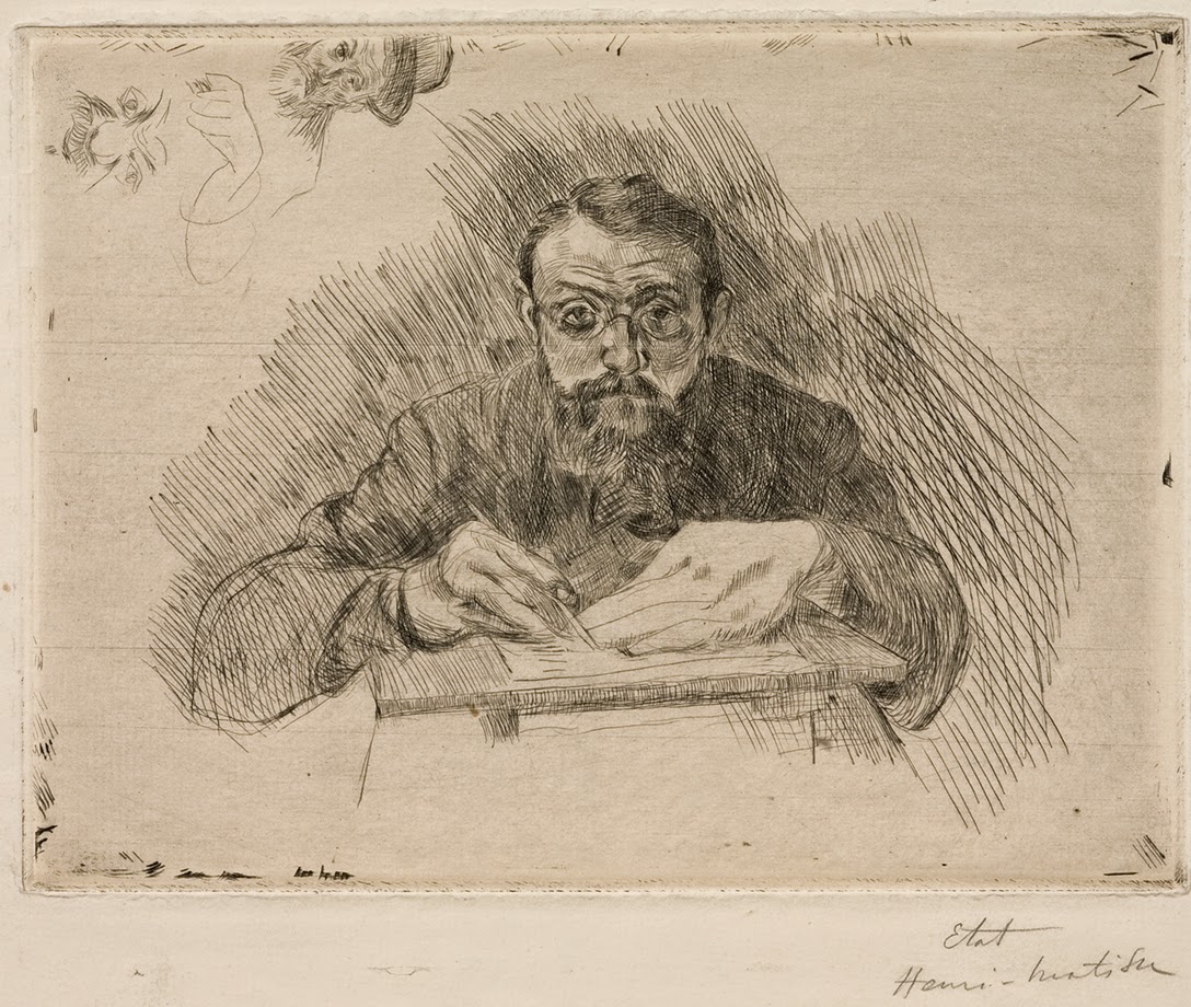
 A painting on canvas by:
  Alan Singer on view at the Jean Geisel Gallery
     in the Bausch & Lomb Building, downtown, Rochester, New York
     during the month of May

It is 1991, and having just started my teaching at R.I.T. - a day arrives when I bring my students downstairs to see how color printing is done on a professional scale.  R.I.T. is known for its School of Printing and for cutting edge technology, and I am taken into the midst of all the pre-press work that goes on to scan and prepare plates for color printing.  This is something that I thought I knew - having worked in New York City for the publishing field in my earlier career as a designer and illustrator.

There, on the first floor of the Gannett Building, I was ushered into a room with some new - very expensive Scitex equipment - and me and my class got to see the new systems and what the output looked like.  The machines had to warm up, and once they did, I was given some paper samples, and it was from these that my thinking changed, and my art followed.  I was fascinated by what had come to the field of printing and even more I was struck by the effect that the computer was having on printing - and it would never be the same again!

"About Time"
    oil on linen,  1993 
    painting by Alan Singer

At about this same time I had acquired an early Apple Macintosh computer, a printer and a scanner to see what they could do.  I began to teach myself Photoshop and Adobe Illustrator, and then in turn teaching my students what I had just learned ( just days or hours before ).

I really would have loved to have been in the room with the designers who came up with Illustrator and Photoshop - just to see how they decided on what was so important for a designer or an artist to know or use within their software programs.  For me, it was also fun to exploit the glitches in these programs, or try to get the programs to do something that was not supposed to happen - deliberate accidents...


"City of Industry"
   transfer monoprint on paper,  2003
  by: Alan Singer

The artwork I selected for "EARLY WORK" at the Jean Geisel Gallery, in the Bausch & Lomb Building during the month of May, 2014 - explores the results I was having with artwork that depended to a greater or lesser degree on using computer programs to help me design and execute fine art ( something that had only been achieved in so called commercial art at that stage ) and I was certainly ahead of the curve in this trend.

What I loved about using the computer was that I could change things in nearly an instant, and my materials costs were going down.  I also like the fact that the results had a kind of abstraction in them that was one part of the program I used, and one part my imagination.


"Sea and Sand"
   transfer monoprint on paper,  2003
   by: Alan Singer

Going forward with this work - to the present day - I began to realize that the computer just applies certain mathematical functions, and so now I want to know more about those functions, and I use that knowledge to create my compositions.  Had I known more about the visual side of mathematics when I was a grade student in Algebra class, perhaps I would have paid more attention!

One real drawback to the sole use of the computer for a visual artist has to do with the skills in your hand and body.  When you learn the old fashioned way, as I did with drawing and painting, you develop eye - hand - and mind in coordination.  These skills leave a physical imprint - as you make the drawing, the drawing makes you.  It is a two-way street.  If you only use the computer - different pathways open up, and they are mostly eye and mind connections.

I get a different kind of satisfaction from my new artwork than I did with the old ways.  Creating art for me has never been very easy, or without some anxiety - but to tell the truth, I can't live without it.

Monday, April 14, 2014

Return to Botany: Pictures From The Plant Kingdom

watercolor by Alan Singer
  from the exhibition "The Power of Flowers"
  At Ock Hee's Gallery, Honeoye Falls, NY

Years ago, before I came to Rochester to teach at R.I.T., I developed an interest in plants and flowers, and then spent time providing design and illustration for books on the subject.  In love with nature, I practiced my watercolor technique that I learned from my father (Arthur Singer) and I often painted from life in the backyard among the flowers that I had selected and planted.  While I was still a graduate student earning my way to an MFA at Cornell University I illustrated a book on house plants that went on to sell thousands of copies.  I found there was a very large audience for this kind of descriptive artwork.


Tulips, May 1, by Pamela Glasscock


After Grad school, I moved back to New York City and not only did I meet many fine artists, but I also met the ones who shared a specialty like mine.  This month, I was able to bring along some of the artists I have met to exhibit their work at Ock Hee's Gallery on Lehigh Street in Honeoye Falls.  I am honored to be accompanied by artists who really know their stuff - this is world class botanical art.  Over thirty years ago I met Pamela Glasscock, and for this show she sent from California some spectacular large watercolors she has made, not only of tulips, but also native flowers from the west just beginning to bloom.
 
Here in the east we have a few nice days and the snow drops (Galanthus) are in flower, buds have burst in the trees, and spring is coming.  For those of you who thought that winter was way too long, you can celebrate the colors of spring at the show we call "The Power of Flowers", open til May 24, 2014.

Variegated Lemon by Carol Woodin

Carol Woodin, an artist who is the director of exhibitions for the ASBA ( The American Society of Botanical Artists) is represented in this show by gorgeous plant portraits on vellum, a preferred material for botanical art.  For years Carol exhibited her work at the Rochester Museum and Science Center during the annual orchid show.  Also on view in this exhibition are Asian styles of painting including several works by Dennis Burns who employs a brush technique that he studied in Japan.
 Dennis has another specialty of creating Japanese Gardens, and he knows his plant materials and what they represent.  It is not just the Lotus flower that has symbolic significance, but also plum blossoms, bamboo, and chrysanthemums.


Joy of LIfe by Dennis Burns

Denise Heischman has painted a tall red Amaryllis for this show, and Dr. Alice Chen has added a delicate portrait of "The Veiled Lady" a mushroom she has studied.  Alice also is teaching Asian brush painting and has several intimate works at Ock Hee's Gallery.  Years back, botanical artists were few and far between, but now there seems to be a rejuvenation of the field, and some of that can be attributed to the active participation of the ASBA and these gifted artists.


"The Veiled Lady" by Dr. Alice Chen

My contribution to this show included selecting some of the artists, and I am also exhibiting watercolors of a lily with yellow specks, some bright sunflowers, and brilliant red poppies -  a nice mixture to remind you that warmer weather will be coming right around the corner.

Friday, April 11, 2014

Henri Matisse In Prints


Matisse as Printmaker:
Works from the Pierre and Tana Matisse Foundation
has opened at The Memorial Art Gallery


Large Odalisque with Bayadère Culottes, 1925 
Crayon transfer lithograph with scraping 
Image: 21 5/16 x 17 3/8 in. 
Sheet: 29 1/2 x 22 1/16 in. 
Pierre and Tana Matisse Foundation (1727 - 109014) 
© 2013 Succession H. Matisse/Artists 
Rights Society (ARS), New York 
Courtesy American Federation of Arts 


This is the month for printmakers here in Rochester; with a major show at The Memorial Art Gallery of the prints by Henri Matisse - spring is in the air and there is so much to see...

Back when I was a young artist studying at The Art Students League in New York City ( in the early 1960's) I was the monitor for the life drawing class and one of the models for the class would show me magazines and photo clippings of the days when she would pose for Monsieur Henri....  I was already fascinated with what Matisse could do with an economy of line and vivacious color in his paintings but I knew very little about his prints.

On my many strolls through the galleries on 57th street I could stop into the Pierre Matisse Gallery, and even say hello to the great artist's son who looked so much like his father with a beard.  At the Pierre Matisse Gallery one could always find something interesting by Balthus or maybe Morandi, or Miro.
But it took a while for me to register the accomplishment of Henri Matisse and his graphic art.  I was mostly impressed with his book arts, especially JAZZ, and now I have an opportunity to really study Matisse here in Rochester.

In fact all the prints on view come from the Pierre and Tana Matisse Foundation and this exhibition is just now circulating through museums in the U.S., so we are very lucky to have them here within reach.
Matisse in his printmaking was traditional, with most of the images at a very intimate scale, and we first see him in this show dressed like an accountant looking at himself in a mirror as he engraves his self portrait.  He sports a beard and glasses and his body seems to emerge from the shadows of the etched lines.


Henri Matisse Engraving, 1900–03 
Drypoint 
Image: 5 7/8 x 7 7/8 in. 
Sheet: 9 13/16 x 12 15/16 in. 
Pierre and Tana Matisse Foundation 
(1303 - 105083) 
© 2013 Succession H. Matisse/Artists 
Rights Society (ARS), New York 
Courtesy American Federation of Arts 


It is these lines that interest me, more than the tonality they create, because this artist would go on in his career to really radicalize what line could do in the arabesque - the dance of line on paper, which he could express so eloquently - and economically in his works from the early part of the 20th century until his last years before he died in 1954.


The Large Nude, 1906 
Crayon, brush and tusche lithograph with scraping 
Image: 11 1/4 x 9 15/16 in. 
Sheet: 17 3/4 x 13 15/16 in. 
Pierre and Tana Matisse Foundation (1714 - 109001) 
© 2013 Succession H. Matisse/Artists 
Rights Society (ARS), New York 
Courtesy American Federation of Arts 


The Large Nude hints at what was to come with Matisse in his art - it is radical in the simplification of the body and this artwork perhaps responds to the cubist impulse that was just ready to hit the artworld.
In the early 20th century it was Picasso who set the pace and the structure of art, and yet Matisse could charm you and stimulate you to think about what color could accomplish ( just think of his "Red Studio" of 1911 in the Museum of Modern Art ).


Upside Down Nude with Brazier, 1929 
Crayon transfer lithograph 
Image: 21 15/16 x 18 1/8 in. 
Sheet: 26 x 19 15/16 in. 
Pierre and Tana Matisse Foundation (1299 - 102007) 
© 2013 Succession H. Matisse/Artists 
Rights Society (ARS), New York 
Courtesy American Federation of Arts 


  This is among the early lithographs by Matisse and a trail can be sketched from here all the way to 1948 in works like " Nadia with a Serious Expression".  With the "Upside Down Nude" - how does Matisse not make this look awkward?  How does he create the space from the model's elbow at the bottom of the sheet to her toes that touch the Brazier?  In many of these works there is a game between perceived space ( and perspective ) and a certain flattening of space that pushes everything towards the front of the picture plane.  I think this is something that has to be dealt with in all two dimensional art - the nature of space and now to portray it, and how to control it ( to the best of your abilities ).  Beyond that it is just a pleasure to see how a master artist catches your eye, and holds it.


Nadia with a Serious Expression, 1948 
Lift-ground aquatint 
Image: 13 9/16 x 10 15/16 in. 
Sheet: 22 1/4 x 14 3/4 in. 
Pierre and Tana Matisse Foundation (1411 - 104005) 
© 2013 Succession H. Matisse/Artists 
Rights Society (ARS), New York 
Courtesy American Federation of Arts 

Henri Matisse as Printmaker 
now through June 8th, 2014
at The Memorial Art Gallery


Wednesday, April 9, 2014

Sophisticated Folk


Bill Stewart at  Axom Gallery

The complex character of the folk art inspired ceramic creations of Bill Stewart, on view now at the Axom Gallery, can be quite funny and demanding at the same time.  I have one of his little pieces at home (it is a clown) and I am always amused by its outward expressiveness and its determined nature to go against art world trends.   I am all for going against the demands of the system, I like to challenge the norms as well, and so in part I am attracted to Bill Stewart's art because of the freedom he has to be himself and to let things develop, without always having to look over his shoulder at what should  be done.


Totemic figures by Bill Stewart

Bill Stewart, in this outing at the Axom Gallery, brings a darker side to the party - and not just because the majority of the glazes he now uses are blackish to begin with.  The closest thing I have seen to this art (from my point of view) are the figurative ( and funereal ) painted wood works from New Ireland, an island chain in Papua, New Guinea.  This thought struck me as I looked at the two figures (above) that Stewart combines in a little boat.

The ceramic figures sometimes hide their faces under a hat, or curls of black hair, or sometimes a form that just looks like a mudpie, and this once again conjures up images of body painting and head-gear that I associate with art of New Guinea.

Bill Stewarts' artwork is popular with people and a whole horde of them came out to hear him speak about his process as an artist and a teacher.  Listening to his introduction, one could understand where he was coming from - the vital period of the early 1960's when many ways of doing things were being challenged.  Bill said that he was enamored of children who "can take disparate objects and put them together" and all the elements would play as an ensemble.


His continuity of artwork is really amazing, and it has the stamp of an American original and his work has had an influence on many people, and other artists for certain.  If you only know the airport figures that greet you at the terminal, you don't know that he has made many more interesting things during his decades long career.  He makes a spiritual, cultural, and political statement in many of his standing totemic figures, some of which are just plain wacky, and others will bite just like a badger.

Sunday, April 6, 2014

Driven By Printmaking - Some Very Lively Artists

Wood blocks
   waiting to be inked...
    at Rochester Contemporary Art Center

Dirty Dozen: The Outlaw Printmakers just opened at The Rochester Contemporary Art Center, 137 East Avenue, in Rochester, New York.

The old notions of high and low in the arts has been cast aside.  Here we have an artform - for the people, by the people, and for the printmakers..  These "printners" owe a debt in equal share to Durer, Daumier, and R. Crumb.  "Dirty Dozen: Outlaw Printmakers just drove into town sporting an "Affordable Print Fair" - where you can get a handmade print for a little over what you might pay for a cup of coffee at a Starbucks.  Or maybe you might opt to watch as your next tee shirt is printed right before your very eyes..  The woodblocks used to print the shirts looked well worn, and were about two inches thick, all of this goes into the press and ink on the newly printed tee shirt dries quickly.  Woodcut was a method Durer used over 500 years ago and it still is a technique of choice as demonstrated on opening night of this exhibition.

Tom Huck leads a discussion
  about his art and life at RoCo

The graphic arts are alive and well as one looks around The Rochester Contemporary Art Center.

Saturday, April 5th the artists gather for a talk about their work on exhibit, and we can experience once again their creative process and glean some insight into what powers these people.  Tom Huck has the timing of a stand-up comedian, and as he said on Saturday, he is into social commentary.  His art on view( a grand triptych that took years to create ) is self-referential, and as woodblock prints go, it is heavily textured down to the lacy edge that had to be hand cut for every print in the edition of twenty-five.

Drive By Press opening night
  and it is back to work, rolling in ink..

Tom Huck says that he wants his triptych to be very rare ( he keeps the numbers of prints in an edition rather low ) but the content and subject matter is very suggestive and somewhat aggressive.  Tom Huck says that if he "wasn't doing his art he'd be taking hostages..."

He may be on to something as he expresses himself with dark humor - making much of the traits he says he shares with his idols that include Goya, Hogarth, and most notably Albrecht Durer.  I might also add that some of his images remind me of a cross between Max Beckmann and R. Crumb.

Tom has also been a teacher and a mentor to some of the other artists in this show including Ryan O'Malley, and the artists of Drive By Press.


Joseph Velasquez and Greg Nanney
create custom tee shirts on a etching press

Drive By Press was there opening night busily making tee shirts and selling their prints, and on Saturday they told the audience how they became noteworthy printmakers practicing their craft and visiting schools that had no printing facilities.  They put an etching press in a van and went everywhere inspiring students to get involved with printmaking.  These artists are nothing if not totally committed to their art, and as Ryan O'Malley said, " the artist's life is very self-centered, it has to be if you plan on getting anything accomplished."


Ryan O'Malley speaks to the audience
at RoCo

Ryan O'Malley directed our attention to portraits on a computer screen which he says were developed using stencils.  We also looked at images which were made by printing laser cut board assembled into symmetrical images that resemble Rorschach tests.  The art on view at "Dirty Dozen" borrows from cartoons, political satire, MAD Magazine, and the aforementioned grandmaster artists of the past. Printmaking represents a move towards the democratization of the arts, taking a step off the pedestal that it has been on and mingling with the people.


Sean Starwars  at RoCo

Some of the particular images in the show will stay with you like the two pink hotdogs on a date, walking over to the nearest Nathan's restaurant.  This work and others by Sean Starwars has a sharp wit and a very individual approach to color - although the predominant color in this show is black - as in black as ink.  The real weight in this show comes from how line is manipulated, and so no matter how an artist like Tom Huck constructs his visual stories,  the line is always poised and balanced even if the imagery is like a nightmare.


Charles Hancock presents William Burroughs
at RoCo

At Rochester Contemporary there is also an exhibition of prints originally commissioned by the Print Club of Rochester, including an edition by Gregory Amenoff that I worked on with the artist in 2004.
It was great to see this selection of prints and it reminds me of the contribution that the Print Club has made to this artform over the years in Rochester and beyond.