Monday, July 25, 2016

The Dreaming


Ithaca, New York, July 24, 2016
via
stain glass window

From my top floor in Ithaca, we look out over a garden through to trees and other homes and businesses and I like to take a few photos through the stain glass window when I'm there.

We are having a little family re-union and then all of us go up to see the exhibition at the Herbert F. Johnson Museum of Art that features modern Australian Aboriginal art - which is a tradition now carried on with materials on canvas rather than sand painting, carving wood or applying colors to the body ( although these practices may continue today they are not included as examples in this show).  I have seen a few exhibitions of artwork from these Australians from time to time, and the artists included in this show called "No Boundaries" are considered to be the most creative and widely recognized for their art.


"No Boundaries" Aboriginal Australian Contemporary Painting
at
The Herbert Johnson Museum of Art
Cornell University

If you have never seen modern Aboriginal Art you are in for a treat, and it might be possible that you could mistake this art for paintings by an American Abstract Expressionist like Richard Pousette-Dart for example.  Looking over the balcony into the first floor of the show, one can see paintings on the wall and floor and they have stylistic similarities (lines and dots of paint are frequently applied ) and there is also an introductory video running at the museum that shows a painting session in progress amidst the scrubby land where the artists call home.  In the video you see a group engaged like a quilting bee - people sitting, talking, and painting on their canvases.  There is a market for this work and the art dealers that set them up with materials are eager to take the freshly finished paintings off to the next show and sale.


Mr. Tommy Mitchell, "Warlpapuka", 2009
Synthetic Polymer paint on canvas, 40" x 60"

The artists artwork might resemble the patterns on your finger tips when you make a finger-print, or the patterns could be paths found on a topographic map.  In fact there is a description on the wall in the museum that suggests the paintings might be a kind of map that would help lead one to food and water.  There is a hallucinogenic quality to these paintings, not necessarily because of their colors which are quite restrained by Western standards, but because of the pulse-like repetitions and wave patterns these artists prefer.
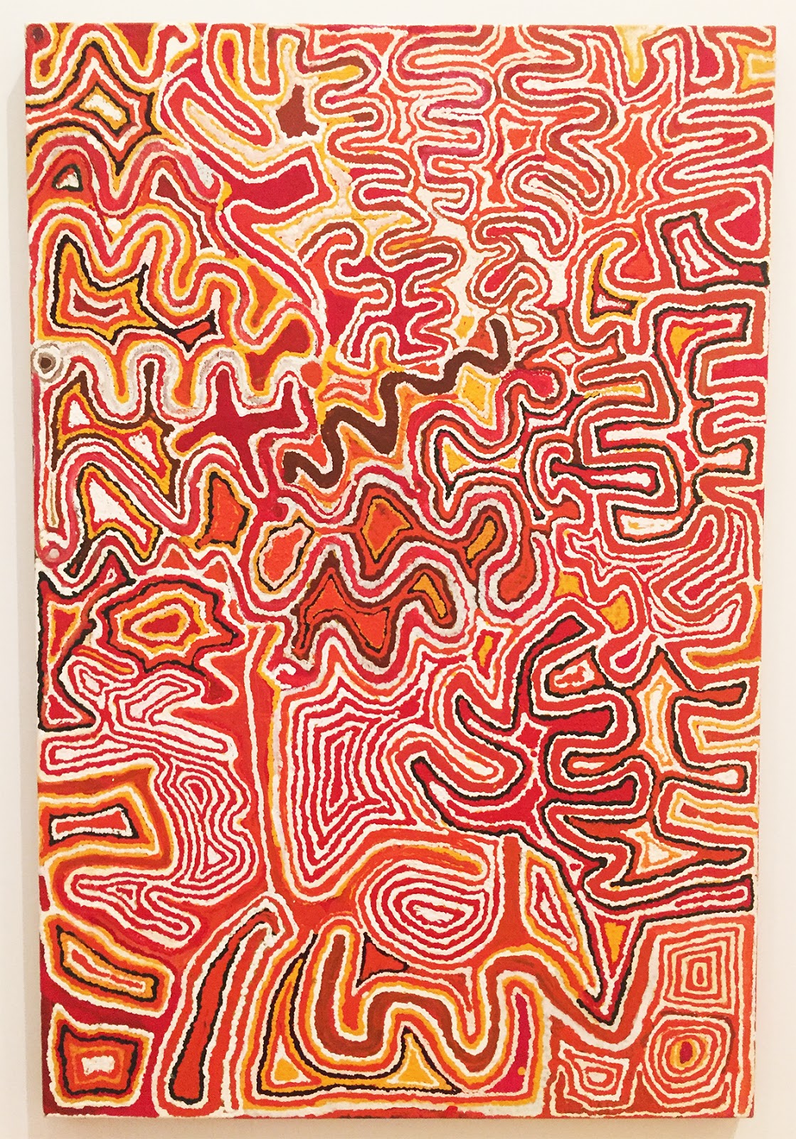

"Wiringurru Painting" by Tjumpo Tjapanangka


One of my favorite paintings from this show of Aboriginal Art had forms that looked like tendrils- the little leaders that grow from plants seemingly searching for light and nourishment.  This painting is made by the artist Boxer Milner Tjampitjin who gives it the title of "Oolaign", painted in 2000,(using synthetic polymer paints on canvas) his composition is a ladder of these tendril-like forms painted with a fresh application of little dots of color on a black ground.


"Oolaign"  by Boxer Milner Tjampitjin

If you read the catalog written for this exhibition the interpretation of what is being represented in this painting is definitely related to the forces of water, the way it can shape the land and effect the lives of the people living there.  Water is the source of life.


Paintings by Ngarra

Though the artists we see here work in a varied style that never becomes purely representational, the art is suggestive and one can make associations with the images as presented.  The artist known as Ngarra has a suite of paintings on paper that could be colorful diagrams of social interactions, or games people play.  Another one of the artists featured in this show, Mr. Tommy Mitchell, constructs more elaborate compositions using a wider array of colors, and these paintings can rival some of the best artwork done anywhere in the last century.  Self-taught painters- mostly instinctive painters, such as these artists really give you something to think about 
 when contemplating visual culture.


"Crossbow" by Matthew Schreiber


Around the corner from the Aboriginal Art is an installation of laser lights by the artist Matthew Schreiber which he calls "Crossbow".  Stepping inside a darkened room the laser lights resemble the strings of an instrument.  You interact with these lights if you move around the room.  There are people in the room with you but you will be concentrating on the red light lines drawn by this weightless material, and needless to say- it is a spectacle.


Japanese prints by Kuniyoshi

Also on view at the Herbert F. Johnson Museum is a collection of things Japanese, including prints, decorative arts, photos and calligraphy.  This is one of the attractions to the museum - it has a fine and varied collection of the arts of Asia, and a most enjoyable show to go and see, and savor.

Tuesday, July 19, 2016

I'll Take Manhattan


The Whitney Museum of 
American Art
99 Gansevoort Street
New York City, New York

Though I was born in Manhattan, I don't get to visit my city often since I moved my family upstate years ago, but when I am there I like to make the most of it.  

When I was a teenager I would walk everywhere in the city and I usually brought my camera.  I frequently decided to walk through the "Meat Packing" district which is way over on the west side along the Hudson River just above the West Village.  I would love to make photographs and contemplate the scene; there was a railroad trestle that snaked through buildings and freight trains would roll in and unload their contents into the giant refrigerated buildings in the area.  Trucks would come and distribute these goods all over the five boroughs and beyond.

Now many years later the texture of life has changed along this area in Manhattan.  The railroad trestle has been turned into the highly successful High Line which is a great attraction, and the new Whitney Museum of American art opened last year to much acclaim.  Their building by Renzo Piano
we would see in various stages of construction, but now we were parked a block away and we walked over to the new Whitney Museum for an in depth look.  The building is bulky like some of the container ships that make their way into the N.Y. Harbor, but when you get inside it is spacious and open and doesn't detract from the experience or distract you like the curvy Guggenheim.


Virginia Overton's water gardens
Fifth floor at the new Whitney Museum


The Whitney Museum presents a different profile from every vantage point outside and there are a series of balconies facing East where once you are in the museum and need a break, you can walk outside and sit and have a drink or just take in the skyline ( which has changed dramatically in the last few years ).  Over this summer a series of water gardens in metal tubs by Virginia Overton are on view.  She lets nature take its course and we get the benefit of seeing water lilies bloom on the fifth floor of the museum ( Monet would be jealous ).


Stuart Davis, oil on canvas, 1921

The main attraction for us at the new Whitney, is a show with the work of Stuart Davis called: "In Full Swing", and it did not let us down.  Stuart Davis went through a number of early stages not represented in this show which is dedicated to his mature style which one could claim is part cubist design and part hard-edged proto-pop art.  Stuart Davis paintings stand out in that they are also a kind of representational abstraction - symbols of an industrial culture with an inflection of jazz music in there for good measure.


"Swing Landscape" by Stuart Davis, 1938

The Whitney Museum presents a spacious selection of Stuart Davis's most commanding art including large scale mural works sponsored in part by the WPA ( Workers Progress Administration ) which put artists to work during tough economic times.  I wondered whether Davis's left leaning politics got in the way of his success after these mural commissions came to an end.


"The Mello Pad" by Stuart Davis

"In Full Swing" starts off with semi-cubist works incorporating graphic designs of cigarette packages and detergent, and this theme of packaging re-surfaces later on in his career when he received an assignment from Fortune Magazine to create paintings about the packaging of goods that we take for granted in advertisements everywhere.


Rapt at the new Whitney
with 
Stuart Davis

Elsewhere in the museum they are presenting a collection of portraits from their archive, and this is a sprawling group show which reminds me that figurative art is in the ascendant today.  I stopped to look at Edward Hopper's portrait, Robert Bechtle, and Fairfield Porter's work to name just a few of the items in this selection.  Something that stood out for me was the Rochester-born artist Florine Stettheimer and her carved wood frame and upbeat color that looked so tropical.  This is an unusual artist that deserves more attention.


Florine Stettheimer, Sun, 1931

I should also stop to say that the inside of the new Whitney Museum is an open layout, the wood floors are attractive, and the lighting is sufficient.  I found nice surprises at the museum but the day was so beautiful we decided to go for a walk on the High Line downstairs.


Walk along the High Line

Today, the trains are gone, but in some places the train tracks remain, and if you have yet to walk along this elevated park - you owe yourself this great pleasure.  It is a way to see New York City that you just haven't done before, and on this glorious sunny afternoon it was a pure pleasure.  Along the route there are little cafes, and even a water feature to cool your feet. I can't say enough about how I enjoyed this jaunt to my old home town.

Monday, July 4, 2016

A Print Collector and the Hokes Archive


Beauvais Lyons, lithograph, "Female North American
Raccoon Crow"

"Conceivably Plausible"
a two person show featuring
Beauvais Lyons and Jennifer Scheuer
at 
The Ink Shop
330 East State Street at the CSMA Building
Ithaca, New York

I'm back in Ithaca, New York, where one can go around on Gallery Night, on a Friday in July, and see a wonderful exhibition that just opened at The Ink Shop at 330 East State Street in the CSMA Building on the second floor.  The gallery show is a two-person affair with artists Beauvais Lyons from the University of Tennessee and Jennifer Scheuer from Cornell University.  If you are not familiar with either artist, this is an opportunity to get to know two very creative printmakers, whose artwork looks to history and science with a sly glint in their eye.


Beauvais Lyons, lithograph, "Fresco Fragments Depicting
Aazzudian Ball Players"


If you have read my blog before, you may know that for many years I made my living as an artist and illustrator - making representations of natural subjects for publishers of books and magazines ( The Total Book of Houseplants, Horticulture Magazine, Birds Do The Strangest Things, etc. ).  So, when I opened the door to their new show at The Ink Shop - I was surprised to see prints of flowers and animals that had a real historical look without actually being very old.  As for Beauvais Lyons - his images are part of a deliberate deception to get you to think and look a little bit deeper.

His take on his artistic subject is a sort of parody of what I used to make my living doing, but his effort to make something "Conceivably Plausible" has a bit of magic ( sleight of hand ) along with some fun, and this gives him a rich vein to work in especially with his use of lithography - heavily based in a realist drawing style.  Jennifer Scheuer works in Ithaca at her images ( she is an Ink Shop member, and Cornell University employee ) and her prints look like plates from the old books one could collect ( I would have loved to buy her fern image at the entrance to her part of the show but it was not for sale ).  Jennifer studied with Beauvais Lyons so they seem to be on the same page when it comes to the studied quality of their image making.


An image from the Association for Creative Zoology

The thing about humor in fine art - if I can backtrack a bit here - is that a laugh can put you in a good mood, or it can detract from what the serious artist has to say.  See the contradiction? - serious artist - funny artwork, and the viewer can get swept up in the joke and loose the perception of how the artist brings you to this point.

I can see the temptation in Beauvais Lyons' work, as I said - having worked on the natural subjects myself, I always felt the need for some humor to give the academic stress of zoology a more human perspective.  It should be said, that when you are at the show, and see the lithograph of the adult Raccoon Crow above at the top of this blog, it only takes a second to see how absurd the image is.  There is a tradition of farce in the theatre, but not so much in the fine arts of painting and sculpture.  I guess that in modernist terms the art object is what it is, and what I see here is an art that is trying to reduce academic constraints but in the process becoming just as academic in the parody.

There is another question lurking here, and it is at what point is this art a pure illustration and does that matter?  Over the recent history of contemporary art, maybe there is less open hostility to illustration as an art than there was say forty or fifty years ago.  Maybe  it is a distinction without a difference, and art is art, you know it when you see it.


Jennifer Scheuer

Getting back to the show at The Ink Shop, Jennifer Scheuer is also experimenting with 3D printing ( there are two rows of what look like teeth in the first room ) and she also works with older techniques like photogravure.  In a series of sepia toned monotypes we get some fine small images of ginseng roots, which are treasured for the medicinal values.  When I saw them I thought that Jennifer should meet Jappie King Black ( who I reviewed a couple of weeks back ) and the two of them would have something in common - especially because of Ms. Black's root like sculptures she has on display at The Dyer Art Center.  Jennifer is a bit more direct in her art than Beauvais Lyons, and she gives her art a look from the past that I hope doesn't distract from the art she has made.


Jennifer Scheuer, trace monotype

With  the previous discussion aside, the art in this show is considerable, and it highlights the aims and goals of these working artists today.  To give your art a deliberate archaic look - does that help in attracting an audience for what you want to say?  It might, and maybe it also brings up the question of what the viewer expects from an art show these days.  One can expect to be challenged in the best sense, and also not to be bored in the worst case.  Ideally a great art show leaves the viewer with a distinct impression and these two printmakers certainly do that.


Beauvais Lyons on left, Jennifer Schemer,  on right
at
The Ink Shop 
to
July 28th, 2016
Ithaca , New York

Saturday, June 25, 2016

Garden Variety


"Garden Varieties"
at
The Mill Art Center, Honeoye Falls, New York


Participating Artists at The Mill Art Center

On this summer day - the sun is out and the temperature is moderate so we go around to see the show at The Mill Art Center before it closes.  "Garden Varieties" has mostly botanical images and I have three things in this show, along with a big group of artists from western New York.  I was happy to be invited to participate and exhibit three watercolors of plants and flowers from my garden which I have painted over the past few years.


Recent portrait of a poppy in progress...

I have said many times that flowers are difficult to paint, mostly because I try to match the colors I see, and then I find that the colors on my palette are pale compared to what nature has to offer.  The paintings I make from subjects like the poppy above - they are studies and not unlike what other artists have made before, in my paintings I try to be accurate and they are the direct response to what I see before me.  I learn right away that my light source ( the sun ) is always moving and it changes the way the subject looks from the time I begin to the time that my painting is done.


Robert Heischman,  painting made from a garden at Dumbarton Oaks

At The Mill Art Center, I find a pair of works by Robert Heischman with subjects taken from the gardens at Dumbarton Oaks in Washington, D.C.  His paintings are strong in composition and also in his ability to communicate light on all the forms.  Trying to show light coming through the petals of a flower is a difficult trick to pull off with paints, and Gail Thomas tries to do that with her portrait of a peony.  Some artists like Lanna Pejovic show a "gardenscape" that begins to verge on abstraction.


top: Lanna Pejovic, and Gail Thomas, below

In order to get in touch with the real thing, my wife, Anna and I,  drive over to see gardens on view - in a garden habitat tour sponsored by The Genesee Land Trust.  This is an opportunity once a year to go and see what real gardeners are doing outside their homes, and we were fascinated by all the varieties of plants ( especially the hostas ) and we were attracted to the ways people were able to make gorgeous gardens on their properties.  It was something Monet would have enjoyed.


Hegeman garden
"The Backyard Habitat Tour"
June 24, 2016


Hosta varieties


Colorful planter

The gardens we visited take a lot of planning, and work to create.  You  have to be resourceful finding the right plant specimens and trying out different compositions just like a painter might create.  Hopefully, the seasons will be kind to the gardens we visited today, and the weather couldn't have been better!

Tuesday, June 21, 2016

Group Show Time


Rochester Contemporary Art Center
6 x 6 
Show

By the way, if you have been hiding out -  it is now Jazz Festival time and that means you have to go over and see the new 6 x 6 exhibition at Rochester Contemporary Art Center.  Last year I put my money down and bought the raffle ticket for the George Condo work on paper, and by cracky - I actually won the thing with my winning ticket!  I was stunned...  So you could go and see this year's show, and purchase a raffle ticket for maybe the Albert Paley drawing or the other works that stand by the entrance.


Look at this selection and then 
buy a raffle ticket

At RoCo they have over 5900 small works pinned up on their walls so you can start a collection, or continue one that you have been building ever since they started this special series of exhibitions.  If you value what they ( at RoCo ) do for our community - and I think they make it a must see for their shows - then you should go over and support their efforts to give our city something to be proud of.


Love Art

Go to the 6 x 6 show and look for the Robert Marx drawings ( all sold ) and the Sheldon Berlyn paintings ( also sold out ) and maybe the perky little image that says I Love Art.  Where else can you go and get genuine works of art by the famous and not-so-famous for twenty bucks a pop?  You will be surprised at what you will find there!


6 x 6 until July 17, 2016 at Rochester Contemporary
137 East Avenue

In another part of town, at R.I.T., I walked into the show "Explorations: A Visual Conversation" at the Dyer Art Center.  I found a robust group show from the participating Arena Art Group.  The Dyer gallery is a beautiful space, elegant like a museum, with natural light and polished floors.

The first thing that caught my attention was "Discourse" - an installation by Jappie King Black that features mummy-like sculpture surrounded by a constellation of root like creatures that looks as if they sprang from the mind of Edward Gorey.  


"Discourse" by Jappie King Black

Since the show is called a visual conversation, and Jappie King Black's installation is called "Discourse", I begin  to wonder what all of the talk is about?  Is it about what effect all this art has on the visitor ( yes ) and is it about invention and ingenuity ( yes ) and is it about the power that a large talented group of artists can muster ( of course! ).  On the little walkway there is a configuration of diamond shared paintings by Stu Chait in his characteristic watercolor way and he shares some things in common with Nate Hodge and his large abstraction.  A trio of heads by Richard Harvey and a ceramic figure by Sharon Jeter greet all the visitors to this show.


Foreground: R.J. Miller "Industrial Babel "
Background: Stu Chait

On the main wall that faces you as you come into the gallery there is a red orange painting by Peter Macon called "Body Language" that conveys its message across a wide expanse and next to that is a suite of images from Dan Neuberger - all part of his documentary on the island of Santorini.


Peter Macon on the left and Dan Neuberger on the right

This is a very big show,  and I hope that you have time to go around and see all the work here, because it is quite impressive, just keep an eye on the time as the gallery is open only from ten in the morning to 2 pm in the afternoon, now thru August 20, 2016 when they have their closing reception  from 6-9 pm.


"The Sound of Color" by Dan Scally
part of the Arena Art Group
at
The Dyer Art Center
R.I.T.

Sunday, June 19, 2016

Happy Father's Day


Alan Singer, and Nathaniel Singer, 2016


My brother, Paul and his family, and myself and my family would love to wish all the Dads out there, a happy Father's Day!  My son, Nathaniel called from Sardinia to wish me a wonderful Father's Day and by coincidence it is also my Birthday - so I am doubly blessed.!!  What I love about this day is the quiet joy of just being alive, and being able to sit out in my backyard and paint a watercolor of some of my favorite flowers.  My wife, Anna, is sitting reading the newspaper... Birds are at the feeders and we water the lawn on this sky blue day.


My studio in the Hungerford Building, Rochester, New York

As the summer goes along we are working to be organized in the studio and ready for new things.  I made a valiant effort to clean up my act, including doing a new inventory.  This is one thing that my teachers didn't tell me about in grad school at Cornell University, and that is if you are going to be in business ( hopefully selling your art ) you have to be organized to actually get things accomplished according to the rules of business.  It is more than just supply and demand, you have to be prepared to locate certain works of art - even if they were made a few years ago... Now, WHERE ARE THEY?


Arthur B. Singer
1917-1990

My brother, Paul and I are also in the final stages of negotiating a contract for a book we plan to publish about my father, Arthur Singer, and his lifelong love of wildlife and the art that he made during his long and very accomplished career.  I think of my father, and how much I owe to him for his inspiration and his tenacity in the process of making his art during his lifetime.  I would like to think that we helped along the way, and in particular my father gave me a chance to work alongside of him and to learn about the kind of art he practiced every day.

In my family, everyone worked on their art.  My mother was a painter, and she also made woven fabrics, my brother Paul painted, and today is a designer, and I had fun as a kid watching all this activity and doing my drawings in Prismacolor pencils ( I still have some of my childhood drawings in our attic ).  Now that I teach art as a Professor, in the School of Art at R.I.T. I hope I can be an inspiration to others.  

So with luck, next Father's Day I will be writing about our new book, and I will let my readers know when it is available... Now I have to get back to my watercolor before the light of day fades.  Happy Father's Day everyone.!!

Wednesday, June 15, 2016

Print Club and "Echoes"


David Row and Kristine Bouyoucos in
"Echoes of the Past"
The Print Club of Rochester
85th Anniversary Exhibition
at
University Gallery, Vignelli Design Center
Rochester Institute of Technology

The Print Club of Rochester is celebrating their 85th anniversary with an innovative showing of pairs of prints in the new University Gallery that is part of the Vignelli Design Center on the campus of Rochester Institute of Technology in western New York.  The University Gallery is a tall space with natural light and it is featuring 15 select artists who show their work next to the prints that inspired them.  The prints that serve as an inspiration all come from the Print Club Archive.  The Archive serves as a study collection and represents the results of years of activity in support of the fine art of making prints in limited editions for subscribing members. 


Juror, Ellen Heck, in black, is second from the right
with Print Club board members

The Print Club maintains its Archive, and you can go online to see the prints that have been commissioned over the years.  Here is the link to their web site: http://www.printclubofrochester.org/presentation-prints-archive/


Artist,  Paul Resika served as an inspiration for Print Club member Dale Klein

By being a subscribing member of the Print Club, you can receive a wonderful work of art each year as part of the member benefits.  Over the years that the Print Club has been in operation the board has selected well known artists to make a print in a limited edition.  As an example, here you can see a work on the left by Paul Resika of a harbor building in Provincetown, Massachusetts, which was a commission from  1999.  Dale Klein took her inspiration from the Resika image, and she made a print based on her experience with the pier out in Charlotte, on Lake Ontario.


Adam Werth
printmakers are celebrated in "Echoes of the Past"

Each of the selected artists in "Echoes of the Past" share a wide range of styles and here we have an image by Adam Werth who after graduating from R.I.T. went on to teach printmaking, so he brings new energy and technology to the task of interpreting the print he chose as his inspiration.  Using the materials found in the Print Club Archive, the selected artists are able to refocus content, renew motifs, and expand on new processes of their own.


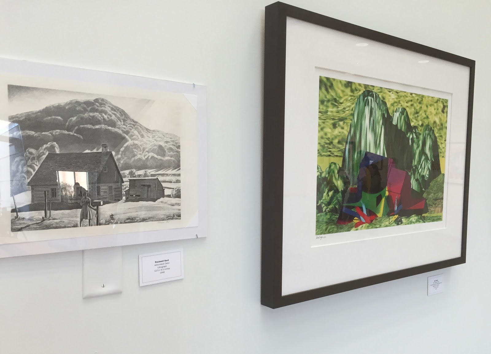
Print by Rockwell Kent on left with new interpretation by Alan Singer on right

The Print Club of Rochester exists to promote the art and study of printmaking, and it is useful to become a member if you have an interest in this art form, especially if you want to build an art collection of your own for a minimal sum.  For several years I was an active member of the board and then the Print Club president.  I had fun working on this image above from a Rockwell Kent of the Adirondacks and a cabin in the hills.


Print by Maria Victoria Savka

Another interesting aspect of the Print Club is that students can join for a lower rate and still get the benefits of being a member, which also includes an invitation to exhibit your artwork in their annual show, and build your resume.  Above is an image from a graduating student for the show, "Echoes of the Past".  So, come out to the University Gallery before August 12, 2016 and review the art for yourself.


Retiring Professor, Tom Lightfoot
reviews the art..


The Print Club of Rochester
at
The University Gallery
Vignelli Design Center
in
Rochester Institute of Technology