At Image City Photography Gallery
Announcing the Winner!
Giving the Blue Ribbon
to
photographer, Stephanie Albanese
Image City is a photographic gallery and it also happens to be the way that people identify the place that this gallery calls home: Rochester, New York. Home of Kodak and Xerox and many other corporate tag lines, this town was built on the making of memorable images. The engineering talent that made cameras, film and printers in and around Rochester is astonishing and there is a deep interest in finding beautiful photography that highlights all the technical wonders. So with the advantage of all the inventions, chemistry, and electronic magic that is necessary to bring us modern photography, we still need the human eye, mind, and nervous system to know when to click the shutter and make the picture.
What constitutes a portfolio of photos that can win a Blue Ribbon? Well, if you are one of the jurors who gets to select the photos, you will know a great portfolio when you see it. What I was looking for ( as a juror ) was consistency in a series of eight photos from each photographer who submitted a portfolio. I also look for something that resonates with me - some subject that engages my attention, and also photos with fine technical values as well as a strong point-of-view.
Stephanie Albanese
at
Image City Photography Gallery
in August
Howard LeVant and I sat down and compared notes after looking over eighty portfolios submitted for this exhibition opportunity. Now, looking over the actual prints on the walls in the gallery on University Avenue, I feel very strongly that we picked some winners. Stephanie Albanese took first prize, the Blue Ribbon, for unusual, nearly abstract images of a golden ball in a variety of settings. While boiling the photos down to their essence - formal shapes, there are still textures to marvel at, and color to grab and hold your attention.
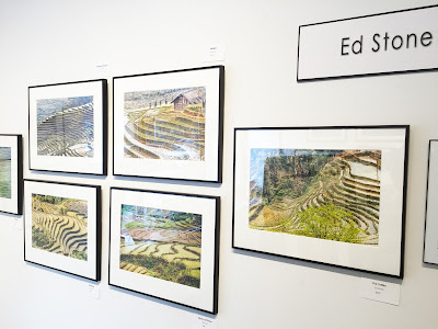
Photographer, Ed Stone
at
Image City
Each photo print in this show demonstrates something to the viewer that can be part of a much larger story presented by the artists who make the photos in the first place. Ed Stone tells a story about a form of agriculture rarely seen outside of South East Asia - these are rice paddies and they form a mesmerizing topography that is also close to pure abstraction were it not for the houses and other evidence of the farmers who work the land.
I was surprised, when I reviewed the portfolios that there were so few images that deal directly with other humans. Not many portraits of people or even action photos of friends dong wild and crazy things to get our attention. We found sober, quiet situations of gradual decay in factories and deserted buildings in the works by Amanda Chatham and David Soderlund.
Photos by Alexandra Latypova
at Image City
Maybe most surprising to me were the still life photos of Alexandra Latypova who has studied paintings from Dutch masters and has re-created table top tableaux that so closely resemble this fine art of the past. Her photos celebrate the intimate interactions of colors and textures found in paintings from the 1600's from artists like Pieter Claesz, and de Heem ( there is a beauty in the collection at The Memorial Art Gallery just down the street ). The still life is set against a dark background and our attention is taken by Latypova's lighting effects which are purely anecdotal, they reveal and conceal at the same time.
Nancy Ridenour
at Image City
Sometimes lighting effects in the age of Photoshop can be overdone, and we saw portfolios that had a gimmick that in the aggregate was not a turn on. Nancy Ridenour makes close up portraits of individual flowers taking the ideas expressed in Dutch painting once again, but giving her photos a modern powerful statement with natural color found in the dahlias and lotus flowers she likes to portray in her portfolio. The only note that I was not sure about here was that the prints of her photos were made on canvas, and they begin to resemble paintings and not photographic prints ( but I am being picky ).
Boris Keller has a portfolio he calls "folktography". The highlight of his work is folk art and it is reflected in the imagery he captures, whether it is an old truck filled with pumpkins, or a brace of geese in the farmyard. Keller's photos are so sharp, and their colors are subtle, yet intense. There really is an art to the production of these images.
For my eye, the elegant photos of wind mills from Steve Malloy Desormeaux are the most sensual, in that they are taken in the middle of winter and you can feel the snow, sense the cold temperature, almost see the wind, and as photo prints go - these images are all different degrees of white. There is a defined landscape in this portfolio that looks familiar yet alien in the same frame. I am captivated by his work, as I am with all the photos we selected for this show. I hope you get to see it. I know you will enjoy the stories being told on these walls.
Photo by Steve Levinson
Juror: Alan Singer with photos by Stephanie Albanese
at
Image City Photography Gallery
August, 2016


